One of FCSAmerica’s goals is to digitize the business and one step in that process is giving customers and prospects the ability to submit an application for financing or refinancing online. Typically, applications are submitted by our Financial Officers after having an in-person meeting at the FCSAmerica office, on their farm or through a phone call during business hours. As more and more farmers get online it’s becoming increasingly easier to gain access to prospects online rather than having to cold call or randomly stop by farms.
The Challenge
Help support a new business model and revenue stream and attract prospects by allowing access to online tools. This should accomplish these high level goals:
1. create an affordability calculator to help farmers know if they can afford a purchase
2. create an online application that allows customers to apply for a loan online
3. make it fast and easy to use with a great user experience
My role in this project included UX research, UX strategy, wire framing. interaction design, prototyping, usability testing and visual design. I worked with another UX designer on this project and we shared responsibilities on all roles of this project.


The Process
I opted for a lean approach which emphasizes research, rapid sketching, wireframing and prototyping, user feedback and design mockups. By including key stakeholders and the development team at specific intervals, I create great team collaboration with lots of great ideas and a strong sense of ownership.
Research
During the UX research portion of this project I used qualitative and quantitative methods which included interviews and contextual inquires along with competitive research.
During the interviews one item that kept showing up was the question of affordability and “can we afford to buy this land to expand our operation”? We took that and ran with it and researched more about affordability and what we can and cannot say due to legal reasons and came up with a solution that solved a lot of those users questions.
There are two main users of the application flow - a producer (someone who farms, ranches, etc) and investors (those who buy land and then cash-rent it out). Based on interviews done with both users the flow had to be slightly different. I also took more of a conversational approach to the application after many competitive research sites are doing the same thing.

Sketching
I typically always being a project by sketching with the key stakeholders and the development team that will be involved in the development of the tool. The goal of these sessions is idea generation.
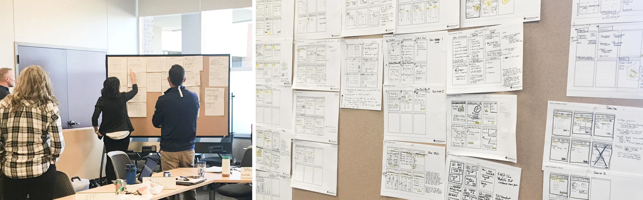
Early sketches exploring options for the new tool.
Wireframe & Prototype
Once there are a lot of ideas from sketching, I take them and start to work on bringing all the best ideas together into wireframes. This is one of the most time intensive pieces of the project. I worked with the product owners many times throughout this process and rely on the rest of our design team to go through feedback sessions.

Wireframes - Landing Page

Wireframes - Desktop Application

Wireframes - Mobile Application
Usability Testing
Once the wireframes were in a good spot and met the business requirements, I did usability testing. We had two different items that we were testing. One was the affordability calculator and the second was the application.
For the affordability calculator, I tested with five different users. Overall, testing went very well and uncovered a few usability issues around operating expense and gained valuable input into future features to add.

Affordability Calculator Usability Testing
The application usability testing session followed a very similar process. For this piece I tested with five different users. Testing, overall, also went well. A few minor usability issues were discovered which were addressed in the screens and updated accordingly.

Application Usability Testing
Visual Design
Once the wireframes were in a good spot, I used FCSAmerica’s existing visual style to start to style the calculator, all the application screens and a marketing landing page that driving paid traffic is being driven to.

Final Designs - Landing Page
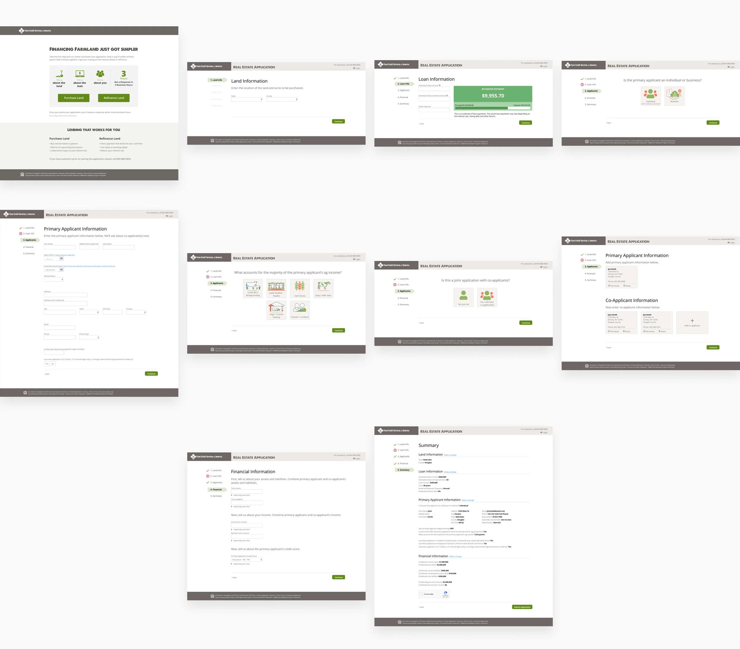
Final Designs - Desktop Application

Final Designs - Mobile Application